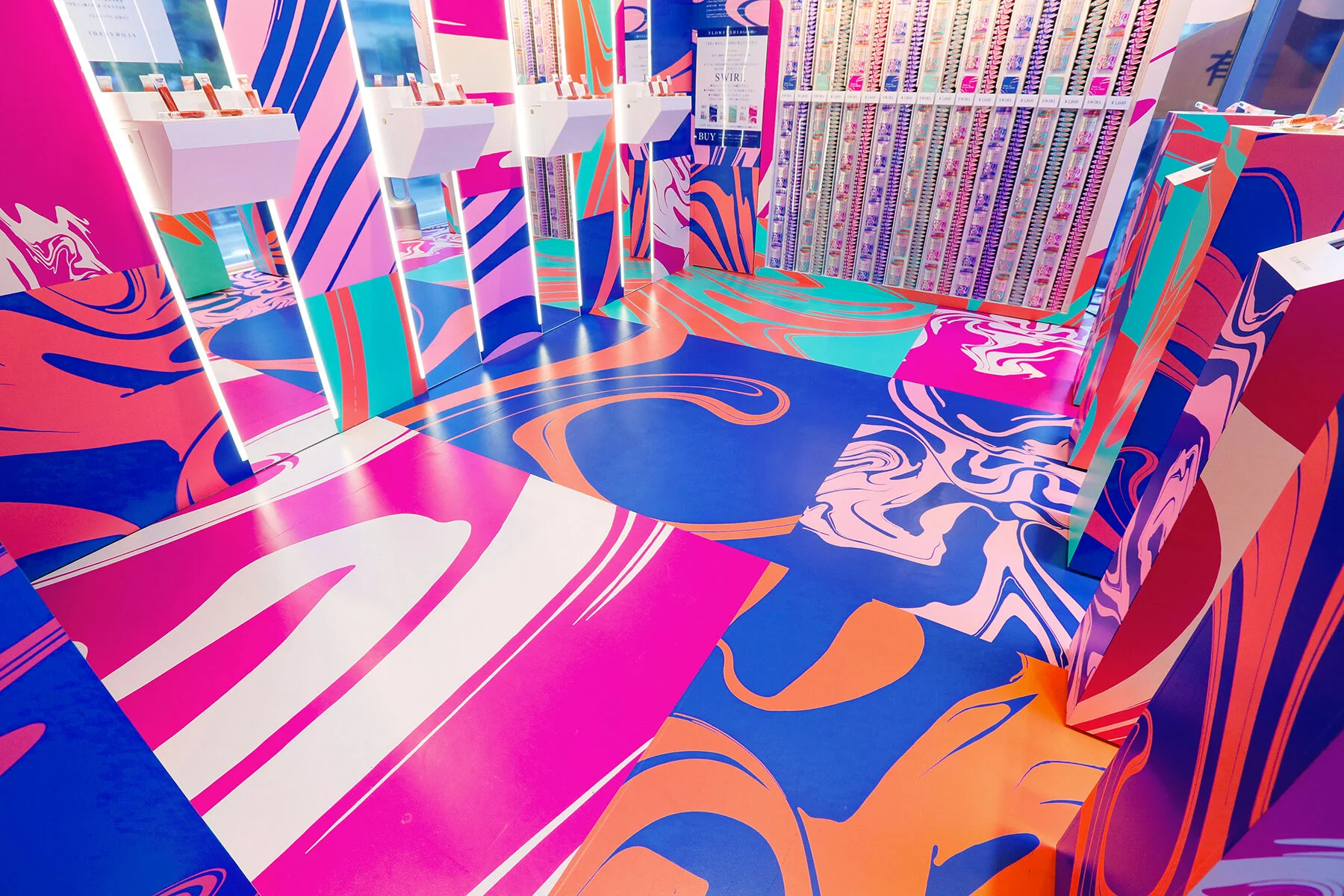
FLOWFUSHI SWIRL
FlowFushi is an independent Japanese cosmetics brand was looking to get their limited edition lip gloss on the must-have list of fashionable Japanese women for spring. This product, called SWIRL, features a unique marbling of product in the bottle. The key visual incorporates the Japanese kanji character “uzu” (Japanese for “swirl”), which is lost-and-found within a bold, swirling graphic pattern. This campaign extended across retail POP, packaging, video, social, OOH, magazine, and a pop-up store.
Creative Director: Pam Fujimoto Designer: Yumiko Kinoshita Designer (pop-up store): Jeff Lancaster Producer: Laura Haithcock / Stacy McCann
Pop-up store: Launched before the product was available in stores in the trendy Omotesando district of Tokyo. For one week, there were long lines, with a steady 4 hour wait to get in.
The pop-up design was strikingly attention-grabbing from the street. Once inside the immersive space, guests could sample product at makeup stations and take SWIRL-branded selfies where they received two copies, one to post on the photo mural wall, and one to keep. Every visitor received a bag of free SWIRL product, before it was available in stores.
Package design
OOH
Case Study


